Words With Friends 2
Where we started
Words With Friends is an iconic game that has stood the test of time in a mobile application ecosystem that is harsh and competitive. It's important in that landscape to stay fresh and to keep reinventing yourself. Our competitors had been chipping away for years and we wanted to fight back while we still had the advantage. Here's what we knew going into the redesign:
New Words With Friends launch created growth in active users but those new users didn't stay.
User pain points went unsolved.
Increased competition in words games.
250M+ people had downloaded Words With Friends in the past.
The first two screens are from the original Words With Friends (2009), the second two are from the New Words With Friends (2014)
Our research method
Since Words With Friends was a live game, we were able to collect a ton of quantitative and qualitative data. We collected information utilizing the following:
User survey reaching ~2,000 users.
App Store reviews and tests.
Consumer insight interviews with rapidly created prototypes.
Extensive 8-week Longitudinal study.
In-game click tests and fake PAC ads exposed to a small audience.
Beta launches of features on one of our multiple platforms.
Metrics since Words With Friends first release in 2009.
Results of the research
As previously mentioned, Words With Friends had been downloaded by 250+ million people. Our research exposed some really interesting insights, the most important being that our users still have a very positive association with Words With Friends. As a result, we felt that by solving our main user pain-points (listed below), we could grow our Daily Active Users (DAU), increasing revenue.
Top 5 reason for leaving according to users
Boredom
Nothing to do while I wait
Nothing new / Same old thing
Game is difficult
Friends left so I lost interest
Based on previous user interviews and historic knowledge, we had assumed that the #1 reason for leaving was "My Friend left which caused me to leave as well." We also looked at our demographic data and found that our current audience (slightly more female, 35-45) was not the same at our peak DAU. Our largest age group was in fact 25-35 years. These results allowed us to think a little differently about the game and which features we tackled.
Ideation and co-design sessions
Results of a Co-Design Challenge (left) and a cross discipline team coming up with the Design criteria and challenge statements (right)
It was important to start with a collaborative process with a focus on Human Centered Design principles. I created Design Challenge statements and ran Co-Design sessions to generate ideas. From there we gathered more data and iterated tirelessly to optimize and get conviction. Below is a breakdown of the design process.
Multi-disciplinary design sessions and backlog review to generate ideas.
In–game and PAC heat tests for prospective features.
Rapid prototyping, consumer insights, and user testing.
Beta or "soft" launch features to a small audience.
Measure and optimize.
Holistic approach
A list of features and which pain-points they touch
We prioritized features based on which solved the most pain points, had the largest ROI, and performed the best during the various stages of the design process. Above is a visualization of the features and how they apply to the user pain-points and additional criteria. This feature also scored very high on a MaxDiff survey which tests user interest of in group of features measured against each other. It’s been one of the most accurate and insightful tools we have to gauge interest.
Lightning Round


One of the first features we developed is listed as Multiplayer (Team vs. Team) above, but evolved to Lightning Round as we iterated based on user feedback. It hit many of our users' pain-points, giving the user a new variation on the game that users could play at any time and was not reliant on friend availability.
Basic concept
Play anytime.
Up to 5 people on each team.
Race to a point total.
Fast-paced and competitive.
More FX, animations, and user delight.
Conviction process
We went through a rigorous conviction process for Lightning Round since it was a new concept that hadn't been done before. There was a lot of pressure to do a 4-player multiplayer mode, but through the design and conviction process, we decided on titling the feature Lightning Round. We are confident this was the correct decision because we prototyped multiplayer and it made some of our pain-points worse, as players had to wait for 3 people instead of just 1. Below are some details on the conviction process.
Surveys and Heat tests
Multiplayer scored very high on the MaxDiff test especiallyIn-game click tests
Users showed interest by clicking on fake adsUser Testing and focus group with prototype
Team vs. Team felt most unique according to focus groupBeta / Soft Launch
Significant increase in Game Creates
5 rematches if a user completes their first game
Our first Solo Challenge event "Literary League" where users could play against authors like Shakespeare
Solo Challenge
To fill in the remaining gaps in solving user pain-points, we decided to go with the next feature, Solo Challenge. This feature allows users to practice against increasingly difficult bots without the social pressure of playing with friends. It's particularly good for new users who want to learn.

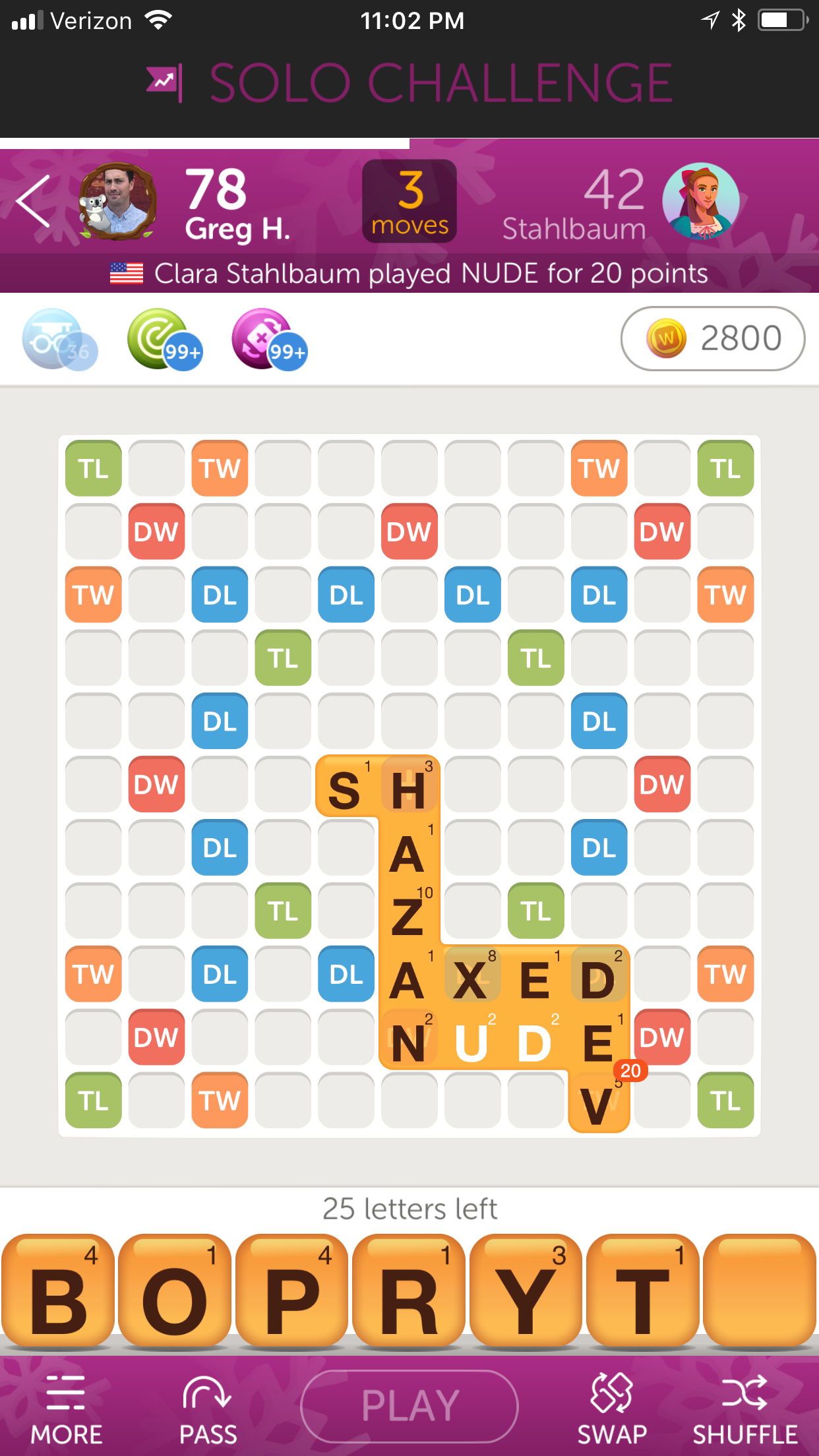

Basic concepts
Play increasingly difficult bots in a safe space.
Themed ‘events’ make the game different every time the user opens the app.
Play styles + bot messages educate users on strategy, game play, etc.
Limited moves adds a new twist to the game users love
Winter Tales artwork by Daisy Chan
Targeted UX optimizations
We scheduled some time for exploration into specific user experiences in Words With Friends 2. Based on feedback from users, we decided to focus on the games list (home screen), game board, and create game systems. We operated under the following principles:
Design pillars
Protect the Core.
Optimized and scalable systems.
Active game environment.
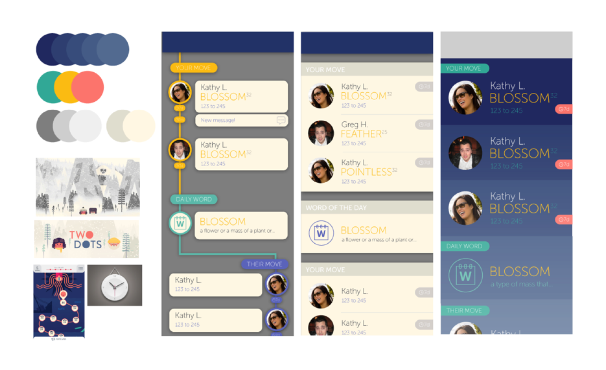
4 Concepts for the games list or homescreen
Games List explorations
We tried a variety of different UX concepts with users based on feedback from users. Some examples are pictured above. We played with the hierarchy of the profile pictures and the game info, experimented with UX of the "Your Move" games, and additional content. I've outlined the feedback below.
App Store reviews complaining that users' games were getting lost in the additional content of the games list.
User interviews stating “Your Move" games were most important.
Nothing new / no active content.
No system for surfacing new features or additional functionality.
In the end, we decided that users want to keep their "checklist" of "Your Move" games. We focused instead on creating systems like the Feature Carousel and the Heads Up Display (HUD). These features allowed us to call attention to new features, frequently changing content and user information.
A screenshot of the final gameslist
The game board
The game board is a very important part of the Words With Friends experience. Similar to the games list, users are very particular in what they want. Any changes we made need to be well thought out and must not get in the way of the core loop. Here's the problem-set we went after:
Users reported they were unaware of word strength and dictionary functionality in User Testing.
Important features are buried under the hamburger menu in the bottom left of the screen.
Players consistently ask to see the Swap, Pass, and the Tile Bag on the game board screen for convenient access.
Different UX for different devices makes it hard to teach users functionality.
Gameboard screen for iPhone X and iPhone 8 Plus. The content remains the same but the layout adjust to fill the extra space.
Along with some targeted UX improvements, we also changed the width of our screens from 320 to 375 points. We made this decision because the majority of our users were playing on an iPhone 8. It had the added benefit of making our spec sheets more accurate on android devices. The changes outlined below helped increase classic mode moves significantly. Keep in mind, since we make a lot of money through ad impressions increasing this metric (moves/DAU) increases our revenue dramatically.
Improved FTUE and messaging system.
Responsive UX fills available space and unifies layouts across devices.
Long tap words on the board to bring up Dictionary.
Pass and swap visible at all times increases moves by reducing clicks.
Create Game Design Challenges


We changed a lot in regards to our Create Game system for Words With Friends 2. Users were stuck in their habits and weren't creating games with new people; we wanted to change that. Below is some data that we found in our research.
7% of "new creates" were from the friends list.
Rematches account for ~70% of game creates.
Most people have 2.5 active games.
23% of new users said they couldn’t find friends.
Usernames were hard to search / find.
Words With Friends 2 Create Game System
Words With Friends Social Screen for a new user (left) with some modules that can be added for users with more friends on the right.
For Words With Friends 2, we completely revised the Create Game system. We wanted to support our 3 main use cases which are listed below.
Users connected via Facebook, who have a large amount of contacts to play.
Users connected via email, who have smaller group of contacts to play.
New users connected via email, who have no contacts to play.
The changes we made increased game creates with Friends significantly. We focused on surfacing users and modes that the users wanted. We also changed the algorithm for surfacing possible opponents to focus more on people that you knew, or people that the user had played in the past, but didn't have an active game with.
Social Tab on the main navigation brings the people you want to see up a level and replaces the create game screen.
Modular design of Social Tab scales to 3 most important use cases.
F.A.B. includes short cuts to game modes/people user cares about most.
Visual Redesign
Final Words With Friends 2 Gameslist (left) and original beta version (right)
Along with the added features and various UX improvements, we wanted to update the branding and visual design. We were designing, testing, and optimizing for the entire time we were developing the product. Below is a breakdown of the process.
“New Look & Feel” always preformed very well in heat tests so we knew it was important.
Multiple user surveys.
3+ rounds of User testing on look and feel alone.
Consumer Insights.
Soft launch for approximately 1 year.
Frequent iteration and optimization.
The first round of user testing


For the first round of visual explorations (examples above) we went big. We experimented with color, typography and layouts without many constraints. We were looking to define the essence of the Words With Friends brand. We wanted to answer the following questions:
Can we evolve the color palette past blue and yellow?
Do we need the tiles on the gameslist?
Can we change the font from Museo Sans Rounded?
Do we need the striped background?
Round two of user testing


In the first round of user testing our player's let us know that they wanted certain elements to remain constant. Players identified blue and yellow with Words With Friends but were open to introducing more color. They also felt strongly that the tiles shouldn't be changed and the font should stay Museo Sans Rounded. We also received the results of a user survey which among many other things asked users to associate celebrities with Words With Friends. Smart, witty people such as Robert Downey Jr, Ellen Degeneres, Alec Baldwin and Neil Degrasse Tyson were the leading picks. This was helpful for us to set the tone for visuals, copy, etc. going forward. We took the results of this round of testing into consideration for our beta launch and users were happy enough to rate our app 4.5 stars consistently.
Final Product


After being live for approximately 8 months we began receiving feedback internally that the product already felt dated and was too close to New Words With Friends. It didn't pass the "carbon dating test" as our CEO called it. The executive staff wanted us to go bigger since this product was meant to signal Zynga's turnaround. We decided to do another round of visual design and user testing which led us to the final design picture above. I'm very glad we did because I think the final design is much more clean, modern and sophisticated. Our user's loved it too and we held on to our 4.5 app rating through world wide launch.
Results


The Words With Friends 2 launch was incredibly successful and put the franchise back into the cultural zeitgeist. There was a ton of media coverage and we ran TV spots for the first time ever at Zynga. It also increased our key metrics and resulted in Zynga's stock price going up to where it hadn't been in years. Below are some key achievements and metrics.
Revenue Growth - Total moves / DAU increased
Audience Growth - Franchise DAU increased
Hit #1 Free App on iOS
#1 Top Free Game on Android