
Step Premium
Overview
The initial launch of Step, the mobile bank for teens, was successful. Millions of teens had signed up for accounts and we had built the foundation for an all-in-one bank since we had introduced savings, investing and other key features for our younger users. We had proven that we had product market fit with younger teens. As we looked to the future we wanted to start appealing to older teens and adults (16 - 24 year olds) who were much more valuable for the business. We had learned that a key to acquiring and retaining that audience was getting teens with jobs to put their paycheck directly in to their Step account.
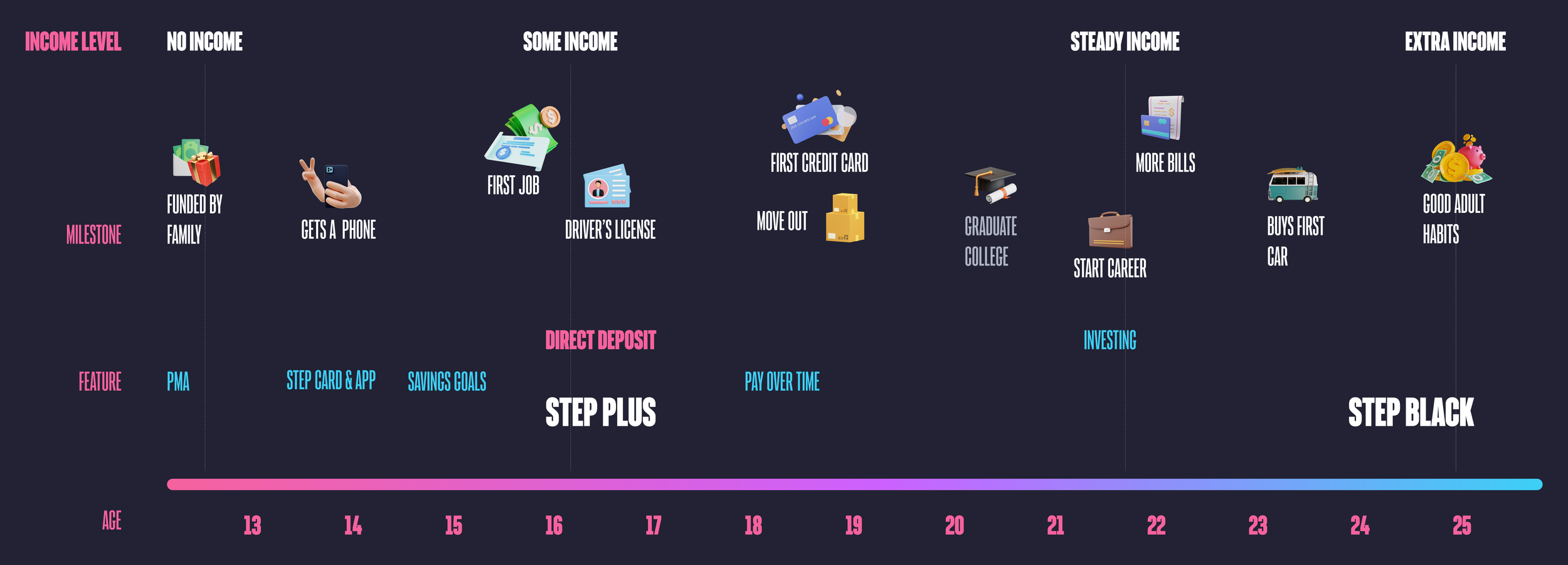
An updated customer journey with Step Plus and Step Black added
Goals
Retain users by incentivizing them to connect their direct deposit or purchase a yearly subscription.
We knew we wanted to incentivize direct deposit but needed to work with the product and finance team to ideate on a package that brought real value to our users. We called this package Step Premium and we thought we could come up with two tiers originally. A lower level called Step+ and a higher tier called Step Black. Customers would get a credit for connecting direct deposit so that Step+ would be free. Step Black was meant to be aspirational for most of our users and help elevate the Step brand. Once we had a general sense of what we could afford to offer for each tier but needed to flush out the details to make sure it resonated with our target audience.
Basic feature set
Interest on Savings Goals
Increased rewards
A metal credit card.
Challenges
This was an incredibly high stakes feature for Steps. A lot of time, effort and money were going into it. We were also targeting an older audience for the first time. Our strategy was always to acquire users when they were young, to develop a good relationship with them so we could serve their needs when they were adults and their business was more profitable for us. It had other challenges as well.
This feature spanned 3 internal product teams, marketing, and the executive team.
The seasonality of teen finances required a launch by the end of the school year to capture direct deposit for summer jobs. It was already January.

Research
Since this was our first real push into the 18+ market research was an integral part of this project. I found the conjoint analysis was particularly effective at helping us shape the feature. It helped us prioritize features and help decide where to put our effort and money based on feedback from a large sample size of our customers.
Interest on Savings and metal Step Cards were highly requested features on Acute (software that allows users to submit feature requests and others users can upvote them)
Conjoint analysis to help guide messaging and find out what was important to this new audience.
We conducted user interviews that included generative exercises and concept testing.

The optimal Step Premium package according to our conjoint analysis
Key Takeaways
The metal card was less important than we thought.
Fees / price are really important
Users wanted interest on savings but didn’t know what APY stood for.
Users knew they spent a lot of money on food so increased rewards on food purchases resonated with them.
With these results we decided to remove the metal card for the Step+ or the direct deposit tier as we began to call it. The cost for creating a metal card was more than the $39.99 price that came out on top in our conjoint analysis and other features seemed to be more impactful for our customers.
Design
To make sure design was efficient I led a collaboration session in-person with all the stakeholders. We aligned on requirements, and the basic feature set. We also highlighted and made key decisions that affected the UX. I used very basic wireframes to express the ideas and prompt conversation. Overall the team and I thought this was a very productive session. The entire doc can be found here.
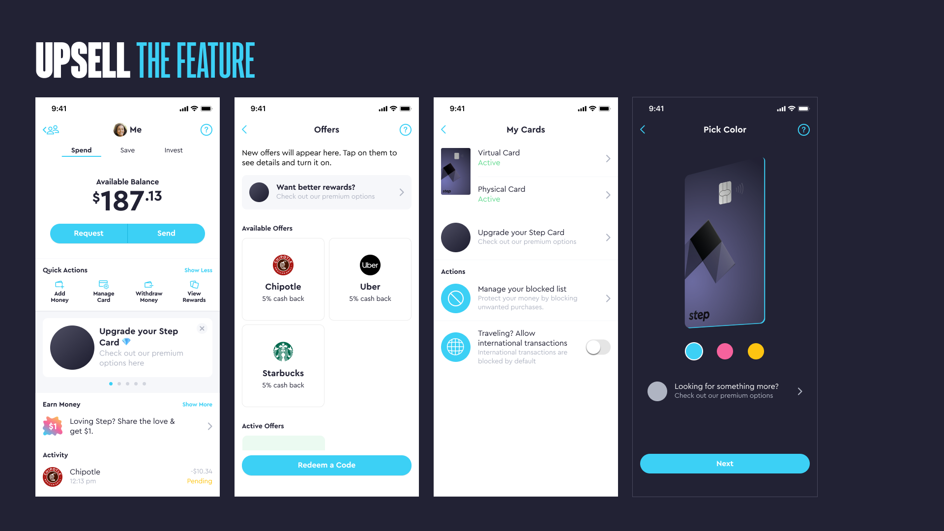
A slide from the presentation I created to prompt discussion around the initial surfacing of the Step Premium upsell messaging.
After the session we began the real work; designing more concrete flows, wireframes and UI design. At this point I delegated some work to the designers on each pod that had engineers working on the feature. My role became more to drive product design strategy and project manage the design process including the hand off to engineering. Here’s how I managed the process:
Driving Influence
I met with different teams privately first to address feedback and before presenting to the larger group.
I focused and refocused the conversations back to achieving the goals versus granular feedback on the design work.
I spent a lot of time discussing with our CEO and CTO to make sure we were in alignment and that their feedback was addressed since they were the final decision makers.

A screenshot of my Step Premium file with pages indicating content, release milestone and status of the design.
Communication
To start I recognized that documentation would be key. There would be so many people reviewing the designs asynchronously.
I created a clear structure and organization to the figma file so teammates understood the status of each part of the feature.
I added a ton of notes to the flows to help provide clarity, logic for engineers, ask questions or request feedback without requiring me to be there.
I also recorded loom videos with me describing the file structure and walking through the designs so that the team could get a detailed overview.
Branding each tier
Once the in app flows were nearly complete I focused my energy on the branding of each tier. We brought in inspiration from other banks, apps and generated images from midjourney. We had changed the plan and now we were releasing the tiers separately both in release timing and conceptually. I held multiple jam sessions with the design team where we worked on the visual design together. The combined creative energy seemed to take us to the next level.

Key screens for the direct deposit tier formerly known as Step+
Direct Deposit Tier
We had decided to roll the benefits of this tier into the marketing of the regular Step Account with the stipulation of having to connect direct deposit to earn them. That meant that from the design side we wanted to stick closer to the original Step branding and visual identity.

Key screens for the Step Black feature.
Step Black
Starting with the metal Step Black Card we created the visual identity and brought it in the app. Step Black users would also get exclusive UI themes. I also worked with a freelance animator named Travis Ragsdale to create a hype video used in the app, on our website and in marketing. I was super happy with the final product.
Conclusion
We launched the direct deposit tier in mid-May (2023) in time for teen’s to add their direct deposit from their summer jobs. So far it helped us set new daily funding records and a dramatic increase in overall funding. It’s still very early, I’m writing this in mid-July.
Step Black had yet to be released but we have announced it and the response has been great. We have a waiting list of 80k and growing.
Impact and Results
Almost doubled customers with direct deposit within months.
Increased overall funding substantially.
Created a waitlist of 80k customers for Step Black.
What worked well
Having alignment on requirements and big decisions upfront allowed for an efficient design process.
Spending more time with our executive team and key decision makers allowed design to execute quickly.
Focusing on organization and documentation of design artifacts made it easy to review asynchronously and communicate information to everyone involved.
What didn’t work well
I should have spent more time with engineering during the implementation process to make sure they were more aware of last minute changes, etc.
I’ll update this case study with more results and final thoughts once the feature has been out a little longer.

Designing a banking app for Gen Z
Product Overview
At Step, our mission is to improve the financial future of the next generation. Our first product was a secure spending card that helps build credit and an app to keep track of your spending. The goal was to become the largest bank for Gen Z in the United States.
My role
In April 2019 I joined Step as the Head of Design. I was something like the 10th full-time employee, there were no designers, a basic brand identity from their website and an app with a referral leaderboard.
Prior to my arrival the team had launched what they called the “Referral App” which had created a substantial waitlist by offering users $1 to invite their friends. The app featured a leaderboard incentivizing users to invite friends but no banking features. While we finalized details on the physical card, I was tasked with designing the banking app.

Timeline of the launch of the Step app
Defining the problem
My task was to design the mobile application for a bank for teenagers.
Making sense of a big problem
To understand the founding team's vision, I ran design sessions and met individually with cross functional leadership. We discussed examples of "best in class" competitors and what we liked and disliked about them. Together we collected a list of requirements, functionality and features that needed to be designed and then built.
Basic feature set for teen users
The Step Card (a secure credit card)
Spending (Checking) Account
Peer to peer transfers
The ability to link a debit card
Research
To get some understanding of the audience I created an interview guide and began conducting interviews with teenagers to understand their attitudes and behaviors.
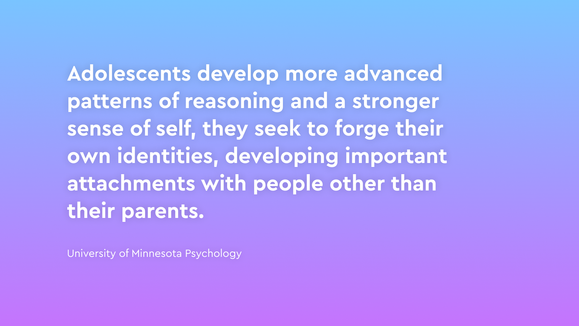
I also read numerous reports, articles, and studies to gain a balanced perspective on Gen Z. I found material on the psychology of adolescence to be particularly interesting.

Key takeaways
Experience and knowledge of banking and finances was lower than we thought.
Most people get their first bank account around 14 years old but experience with finance varies… a lot.
Both children and parents wanted financial independence for the child.
Young people didn’t have a lot of money so checked their balance frequently.
Based on all of the research we prioritized jobs to be done, created design pillars, and user personas. These artifacts helped provide structure and direction to the design process.

Design pillars from the initial launch
Jobs to be done
Viewing my balance - Do I have enough money to make a purchase?
Transferring money - I want more money
Financial Health(?) - Where did my money go?
We started the design process prioritizing these actions.
The design process
Starting with high-level "movie poster" concepts, I collaborated with stakeholders to align their vision. These concepts helped us pick our favorite UX patterns and start to organize features and functionality.


We had a very limited feature set at time of launch so after considering several options, we went with a simple version based on concept 1 that focused on the top jobs to be done (Account balance, transferring money to other people, and the past transactions). As we began to finalize design decisions, I formed the spec to document them.

Final App Navigation is simple and focused on balance and P2P
Once I had the basic structure of how the app was organized I started to flush out the UX for each feature like P2P. There was a lot to do so at we hired a junior product designer (the talented Olivia Ouyang) to help with the workload. I was able to delegate functionality and flows which allowed me to think about the big picture a little more. Figma organization became super important once there was more than one person working on the files. To maintain quality and consistency I started creating a design system with basic components for the app.

First version of the peer to peer transfer flow in the Step app
At this point we recognized that we needed to create icons, illustrations, etc., but hadn't discussed the art style or visual identity. So the design process took a little detour while I worked on that but at least I had Olivia to continue to work on the app.
Defining the visual identity
We created personas, brand pillars, and guidelines based on our prior research. And after collecting art inspiration with the team, we explored a revised art style that aligned with our brand pillars.

Initial brand pillars for Step launch
I created moodboards with inspiration and competitive analysis that we thought demonstrated the characteristics of our brand pillars visually. These helped guide our own explorations.

These were some of the top examples that the team liked from the moodboards I created.
We created example illustrations internally and hired an agency to create some. The goal was to explore a variety of styles. Below are some samples.

Early explorations created by Olivia Ouyang, Fireart (a digital agency) and me.
Below is the art style that won out in the end. The teens we interviewed liked it and we were happy with the result.

Examples of the illustration style I created for the first version of the Step app.
Early Product Testing
As engineers started work on the app we finalized the art style directions we wanted to show and created a robust prototype of the app design. We recruited teens that the team knew or customers from the referral app to help give usability feedback and guide our decisions. We did picked a final art style and improved important flows like onboarding and transferring money.

Parents couldn’t find their teens account in our usability sessions
Usability Feedback
Sponsors found it difficult to find and fund their teens account.
Users favored the art style with doodles and photos combined.
We quickly tested some solutions to make it easier for parents to fund their teens account. Product education like the gif above didn’t seem to work so we ended up added some more explicit arrows to guide them (image below). A larger change was made right after launch that solved the problem more completely.

Soft Launch

Starting in December 2019, we began testing the real product internally and with friends and family. We then added real users from the waitlist, starting in January 2020. In May, we opened up the app to all potential users but in stealth mode (no marketing).
As we rolled out our product we wanted to test the basic functionality and monitor key metrics to identify areas we could improve before putting marketing dollars behind a public launch. The biggest problem we wanted to fix was with onboarding conversion. It was challenging to onboard two different users (parent and child) to the app but it was required since children can’t open bank account without adult approval. We focused our efforts on these moments:
Soft Launch Objectives
Increase requests sent by children
Increase the number parent’s accepting requests
Next we wanted to talk to users to find out why they weren’t completing these steps and collect general feedback on the app.
UX Research - Real Customers:
Next we conducted moderated interviews with 15 teenagers and 10 parents and surveyed hundreds of responses. We focused on teens since our research showed most children get a debit card around 14 years old and to avoid COPPA restrictions. The surveys and interviews provided more insights into general attitudes and behavior, and usability testing helped identify teens' pain points.
Pain points
Teens didn’t think their parents would approve
Teens didn’t think there parent’s had time
Customers had concerns about the app's legitimacy.
Customers still had concerns about entering sensitive information.
We were missing basic features like ATM, Savings, etc. that they expected from a bank.
UX Optimizations and Experiments
To improve these metrics and pain points we ran onboarding conversion tests which came out of targeted design sessions I ran. Below is a list of some of the experiments.
Forced the child to ask their parent for approval during sign up.
Gave the child talking points to help in person conversations with parents.
Added web landing page to provide parents more info.
Added a primer to prepare sponsors for entering sensitive information.
Added recurring payments (Allowances)
Added the ATM feature.

Basic UX for setting your ATM PIN. We were shocked by how many teens wanted access to cash in our soft launch.
Unsuccessful tests
When it comes to growth I think building a culture of learning is important. So in the spirit of promoting experimentation here is a list of unsuccessful tests we ran:
Web sign up flow.
Videos on our website landing page.
Reducing and reordering the onboarding steps.
At least 1,000,000 messaging tests
Different referral amounts and reward criteria.
Sending articles on Step in messages to parents.

Thumbnail for a test video sent to parents of teens that want to join Step. One of many unsuccessful tests we ran to improve onboarding conversion.
Soft Launch Results
By the time we were ready to put marketing dollars behind a launch we had achieved the following results:
Improved overall teen onboarding conversion
Improved parent conversion
Added 2 of the most highly requested features by customers.

Early tiktok post from Charli D’Amelio
The public launch
We officially launched Step on September 26, 2020. We partnered with the biggest TikTok influencer at the time Charli D’Amelio. By the end of 2020 we had over a million accounts created. Here’s some key learnings I took away from the experience.
What worked well
Being live for so long before our public launch let us better understand the audience so we could optimize flows and improve their experience.
Having a clear list of requirements made building the initial app faster and more efficient.
What didn’t work
Focused too much on optimizing flows and not exploring some new, larger ideas as well.

App Store screenshots of our peak on the app store during launch
Conclusion
Overall we were super happy with the launch. The initial app included all of our requirements plus some additional features. While the timeline was longer than we hoped our initial user growth really exceeded our expectations. Step still has a long way to go before becoming the largest banks for teens in the US but by all measures the launch was extremely successful. Here are some highlights:
Highlights
#14 overall on the app store (peak)
#2 in the finance category on the app store (peak)
1 Million teen accounts by the end of 2020